We have been working for GitLab for some time, analyzing activity, community and performance in several of their projects like GitLab CE and GitLab EE. And of the questions they have asked has been: how many merge requests do we have open each week?. This workload insight helps to manage the effort spent in code review.
Sometimes when we visualize a backlog (a set of actions to review or to solve), we do it as a view of accumulated open things built from the present. That’s good in order to visualize how we start to accumulate things. However, it does not offer a clear view on how we’re managing the workload. In this post, we will show you a way to better manage a Merge Request backlog based on the work done for GitLab.
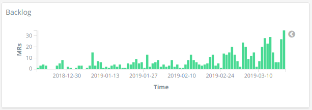
For instance, in a chart like the following one, each bar shows the number of things, for example, Merge Requests, that were created at that time and still remain open today. As said before, that’s indeed a good view on how we start accumulating things, however it does not offer a clear view on how we are managing the backlog.
In old Kibana (the core visualization tool in GrimoireLab and Bitergia Analytics) versions that was difficult to achieve, but Timelion appeared to help us building more complex charts combining different dates (creation, merge, close) in the same timeline, so that an evolution of the backlog is feasible and not so difficult to build. The result will be a chart like the following.
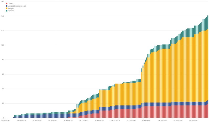
In this chart, the whole colored area shows the total number of merge requests in the community at the given time, no matter what state they are. Unlike GitHub, where they only have open or close states, in GitLab there are opened, merged, and closed states. Then each color fills the area corresponding to the given state. They are actually stacked bars close enough to look as a whole. Purple color corresponds to merge requests that were merged before GitLab stored the date of the merge, so we cannot know the exact time and we just used the latest update date as a not-so-rough approach.
Going deeper into details, this approach is based on using cumulative sums because in Kibana we always need to rely on a document field of type date to draw things. That means there is no way (or we don’t know any way by the time being) to get an empty timeline and then put documents along that timeline depending on a given condition (in this case, condition would be closed_at is greater than the timeline point in which I want to count that document). In Kibana we always declare a timefield, which is a field belonging to documents, and then Kibana draws the item along the timeline based on that field.
To overcome that limitation we decided to use cumulative sums, which allows us to count a document from its creation date, week by week (or whatever time unit we configure in the chart), to the end of the timeline. But this is partially true, because we need to stop counting it when it is merged or closed. Luckily we have merged_at and closed_at dates, so we can exactly know the point in timeline where some Merge Requests needs to be subtracted. And that’s what we do in the chart, subtracting at any given point (week in the chart, to be specific) all Merge Requests which merged_at or closed_at dates are within that time slice. The effect should be we start counting Merge Requests as they are created, adding them as long as we move forward week by week. We also subtract those that were merged or closed exactly in the week they were merged or closed. So the result should be an evolution of the number of Merge Requests in the opened state through time (green color in the chart).
There are some limitations and issues it is worth mentioning:
- As cumulative sums always start at 0 at the left hand side of the chart, to have a meaningful backlog we need to make sure to select a time range that includes all Merge Requests history, so everything is taken into account in the sum.
- We’ve added four different states in the chart:
Open: cumulative sum of MRs that are in the opened state at given week.Closed: cumulative sum of MRs that are in the closed state at a given week.Merged: cumulative sum of MRs that are in the merged state at a given week.Merged (no merged_at): cumulative sum of MRs that are in the merged state at a given week but for which we don’t have information about when they were merged.
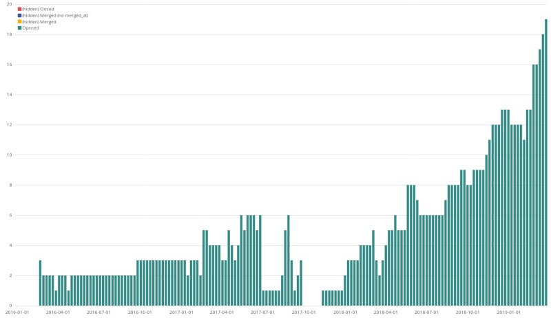
Of course, we can answer GitLab’s question just hiding other states and get a view of the evolution of Merge Requests in opened state each week:
And this same approach can be taken with any other data source supported by GrimoireLab/Bitergia Analytics and related with issues and code review (processes that involve some kind of state) like JIRA, Gerrit, GitHub Issues, GitHub Pull Requests, GitLab Issues, Bugzilla, etc. And there is no need of an specific plugin for any of those tools to start tracking them, you can start playing with GrimoireLab as it is.. So, go for it and level up your software development analytics!