On Thursday, November 15, 2018, Uber hosted its first open source event, Uber Open Summit 2018 for developers and community leaders. For this special occasion, Bitergia created a report to highlight Uber Open Source community engagement. Like many open source program offices, Uber open source had questions regarding project activity and performance, two important factors for decision making. Here are some examples of those questions:
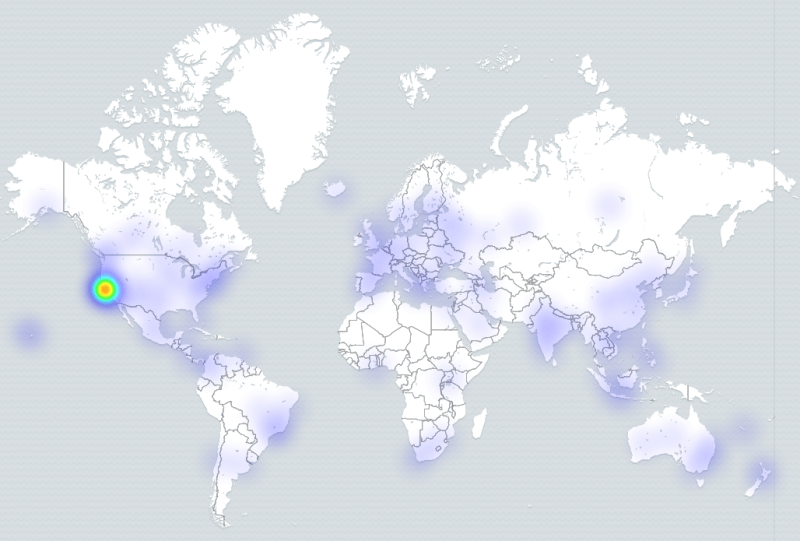
Where are my contributors?
You can easily visualize this by tracking issues and pull requests from Uber’s contributors during a specific period of time.
Of course, there are other ways to check the geographical diversity of Uber’s contributors. For example, looking at committer activity by time zone:
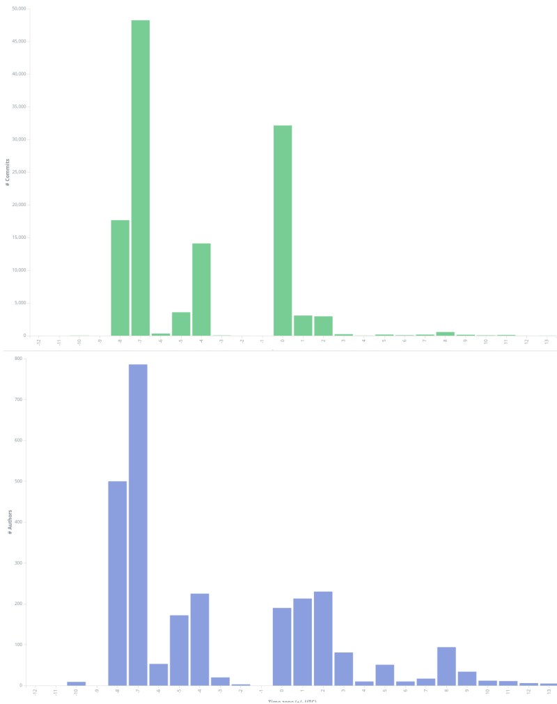
These charts clearly show that Uber’s OSS projects have mainly contributions from USA West Coast, but the contributors are distributed worldwide.
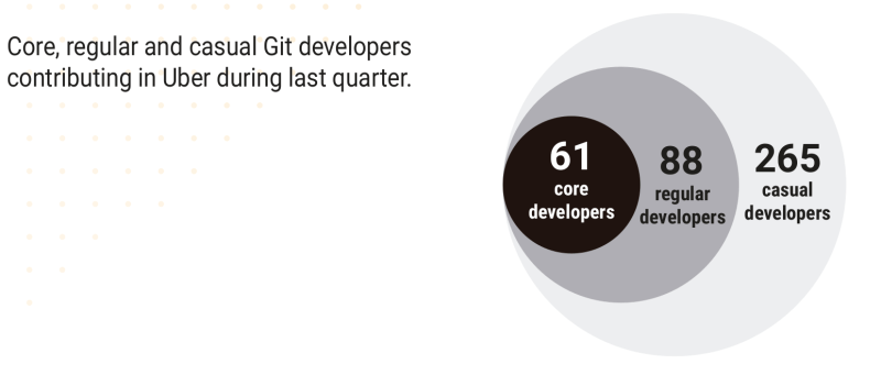
How many core, regular and casual developers are in my community?
Many people know about the Bus factor, and since it can be hard to measure, our approach is to identify who the core, regular and casual project contributors are, based on people’s activity:
- Core contributors: those whot have done 80% of the contributions for a certain period of time
- Regular contributors: those who have done 15% of the contributions for a certain period of time
- Casual contributors: those who have done 5% of the contributions for a certain period of time
This specific way to target community members we called it the onion analysis, and by contributions you can be talking about commits, issues submitted, pull requests submitted, etc.
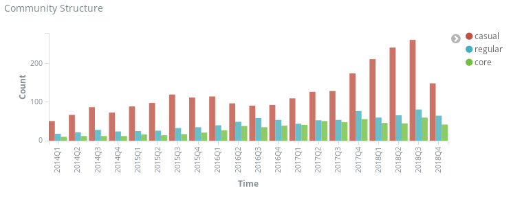
Of course, you can also see the evolution over time by quarter of those numbers:
Is my community growing?
By tracking the total number of developers and repositories over a period of time, we can see the evolution of Uber open source community. But we can go one step beyond this metric by also identifying how those developers collaborate in the different repositories.
By comparing Uber’s 2017 and 2018 project and contributor networks we can visually check how rich and complex Uber’s OSS ecosystem is becoming.
How do we gather more information about our program?
Like some Bitergia’s customers, Uber has one public Bitergia Analytics dashboard both as transparency mean for the OSS community and also as a tool for data-driven decision making.
If you are interested in getting your own community data, you can start by free (as Freedom) with GrimoireLab or you can ask us to do it for you.