
Welcome to the third chapter of the Metric of the Month, the first one for the new year! In the last chapter, we talked about the Pony Factor, a metric about code contributions to projects. In this chapter, we will study how many new contributors are attracted to the project with the Attracted Developers metric.
We’re thrilled to start the year by continuing this metrics series. We enjoy showing you a complete guide for different metrics each month so you can understand more about them. Now, let’s find out more about these developers!
Who are the new developers joining?

Analyzing software development makes it possible to estimate when a contributor joined a project. At Bitergia, we calculate when a contributor made their first contribution. This contribution can be either a Git commit, submitted GitHub pull request, or submitted GitHub issue. We focus in the following text on the Git commit contributions to narrow the analysis to software developers.
The Attracted Developers metric defines the number of developers that joined the project during our analysis period. This metric is handy in two cases. The first one is when we analyze the people who recently joined; so community managers can welcome the newcomers and ensure the onboarding process takes place. The second scenario aims for a deeper analysis of the project’s health. We will talk about it in the next section.
Goals of this Metric
When analyzing the health of a project, one of the key indicators is the number of new contributors joining. It is critical to identify if a project or community has fresh blood that will make the project sustainable in the future. Depending on the project phase, we may find either an increasing or decreasing trend.
For example, very stable projects will not have a lot of new developers. Is this something good? Well, this will depend on two related things: 1) the number of developers leaving the project and 2) the total number of active developers. In the next blog post, we will explain how to study the number of developers leaving the project to gain deeper insight. Regarding the total number of developers, we’ve learned that calculating the Pony Factor will help us to understand how dependent a project is on just a few developers.
Implementation
This analysis requires pre-calculation. That means we can not take advantage of all the possibilities offered by OpenSearch, as only some filters can be used together and get accurate results. The analysis starts by identifying all the unique contributors in the data sets for commits, GitHub issues, and GitHub pull requests. As we mentioned in previous blog posts, this is essential for a correct analysis. We maintain an identities database using the GrimoireLab SortinHat tool for that. Once the process identifies all the unique contributors, we need the data enrichment process to calculate the minimum date and store it in a dedicated field. The name of that field is `demography_min_date.`
The demographics index has all the information we need. To show data for attracted developers, we need to filter by the field `data_source:git`. All the records in the index will have the first contribution date for the commit’s author. To create a table with the newcomers, we can create a table following these steps:
- create an enhanced table with the `demographics` index
- use the “Min” aggregation with the field `demography_min_date`
- create a bucket with the “author_name”
- create a bucket with the “author_uuid” to have a link to the profile in SortingHat
- create a bucket with the “author_org_name” to see the organization for that first contribution
When the table is ready, add it to a dashboard and order it by the date in reverse order to have the most recent additions on top.
Where can I find this metric?
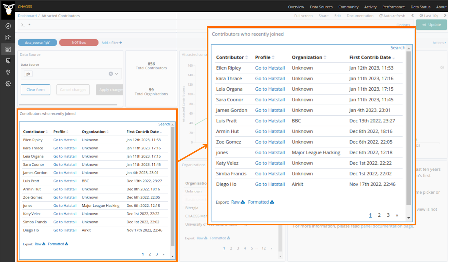
GrimoireLab and Bitergia Analytics provides this metric out of the box. The dashboard Attracted Contributors shows the evolution of attracted contributors in the last ten years and the ones who recently joined. Select the “git” data source in the dropdown selector to show Attracted Developers.
- View an example on the CHAOSS instance of Bitergia Analytics.
- Download and import a ready-to-go dashboard containing examples for this metric visualization from the GrimoireLab Sigils panel collection.
Watch a short video tutorial about the Attracted Developers metric and how to set up this metric on our Platform:
Want to know more about Bitergia Analytics Platform?
Bitergia Analytics is a complete solution to get full insights into software development projects. It is a comprehensive solution that includes an analytics platform, training, support, and consultancy to make the most use of it.
Customers of the Bitergia Analytics services can reach their goals and make data-driven decisions about their software development teams. In fact, they can achieve this through the 4 services: Strategy, Customization, Analysis, and Reporting.
Next Chapter: Developers leaving
In the next metric of the Month chapter, we’ll continue talking about code contributions to projects, but this time we will study how many new contributors left the project. The metric Developers Leaving defines the number of developers that left the project over time. Don’t forget to subscribe to our Newsletter to get your next edition first!
Latest posts
- Organizing CHAOSScon Africa: Insights, Talks, and Key Takeaways

- Diversity, Equity, and Inclusion in Open Source: My Journey and Contributions at Bitergia

- Project Awareness and Popularity: Essential Metrics for Open Source Projects